Share this article
You’ve crafted heartfelt, donor-centric campaigns and appeals, your social media followers engage with you… but your online giving doesn’t seem to be going so well. Why? It could be your website! Rachel Clemens, CMO of Mighty Citizen, presented some fantastic insight and action items at 2018’s Nonprofit Technology Conference for improving nonprofits’ websites to get donors giving online!
Why does paying attention to what the heck is going on your website matter?
In 2017, the percentage of total fundraising that took place online sat at 7.6%, and the percentage of online giving that was done from a mobile device was 21% (according to Blackbaud’s Charitable Giving Report). If you have a website and it’s not mobile-responsive, you could be losing out on donations! Sites that aren’t mobile-responsive no longer rank as highly in Google’s search results. It literally pays to get your site up to speed with modern times.
Where do you start? Internally. Before you hire outside help for your website, sit down with current stakeholders and set some goals (don’t forget to document them and know how you’ll measure them). The first thing you need to ask is What are you trying to accomplish with your site? The answer to that question becomes your overall call-to-action.
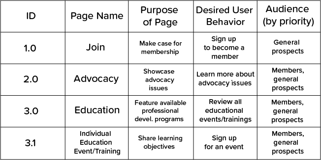
Not only do you need to think of an overall goal for your nonprofit’s website, it’s important to set a goal for each page of your site. Think of your site as a collection of goals. Be sure to speak to the owners of each page to gather information about the content and call-to-action. A good way to start is with a content audit. In the example from Rachel below, each page was assigned an ID number with the name, purpose, desired user behavior, and desired audience recorded.
User Types and User Journey
Another thing to keep in mind is that not everyone visiting your site is going to be the same type of user. You could have volunteers, donors, partners, or clients accessing your site at any given time. Each of them has a very different set of needs and desires, and each of them should be able to navigate your site easily, which is know as navigating with cognitive ease. You’ll need to anticipate your varying users’ needs and give them what they’re looking for. A great way to do this is to develop user personas for your site visitors. Check out this great article by John Haydon on the subject: How to Create User Personas for Your Website.
It’s important that your user journey pathways are clear and free from cognitive load. Make sure you’re not overwhelming any of your users with too many forms of navigation, too many call-out boxes, too many images… basically too many/too much of anything! Keep it simple and easy!
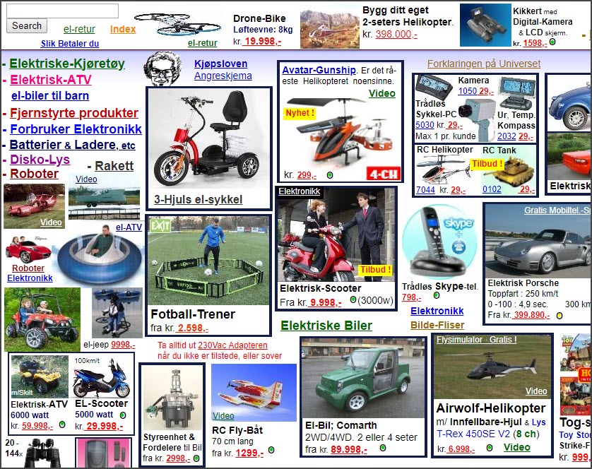
A great example of what NOT to do comes courtesy of a Norwegian company’s site. Betcha’ don’t even know where to look first.
Must-Haves
As you’re updating your site, there are a few things that you absolutely must have. No, really. You need these.
- Mobile-Friendly Site
- According to Whole Whale, over 50% of web traffic is from a mobile device. If you don’t have a responsive site, you could be alienating over 50% of your site visitors!
- If you’re doing social advertising, people are usually accessing it from their phones, so landing on a responsive site once they click through an ad is important.
- Search Engine Optimization
- Carefully research and pick keywords that will get your desired audience to your site.
- Make sure you have great optimized content that you actually care about… not just a paragraph loaded with keywords for the sake of getting people to your site.
- There are tons of tools available—here’s a great collection compiled by Buffer.
- Accessibility
- Your nonprofit’s physical location has to be accessible, right? So does your website.
- Over 50 million Americans have a disability.
- Consider things like alt-tags for the visually impaired and blind, as well as visual contrast for color-blindness and aging populations.
- Hero Message
- Include a short, concise message on your homepage that cuts directly to the core of what your organization does.
- Be simple, concrete, and give your visitors a reason to care.
Your Donation Form and Thank-You Page
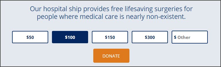
The ease-of-use of your donation forms will make or break donor interactions on your website. If it’s too long, donors will abandon the form. The average eCommerce transaction takes about 3 minutes and 58 seconds. The average nonprofit donation takes a little longer, at around 4 minutes and 15 seconds. Keeping forms simple and easy is critical. Here are some great examples of donation forms that cut out the noise.
Your donation form isn’t the only part of your online giving that’s important. What happens on your thank-you page after a donation can have a big impact on donors returning to your site. Rachel says that the thank-you page is the most underutilized tool in nonprofits’ toolboxes. It doesn’t have to be an expected exit page—you can use it to get donors to take action. Research shows that people feel best when they’ve just given, so help them continue to celebrate that with your content and imagery. You can link to other sections of your site that show how their donations make a difference, other ways to get involved with the organization, or offer ways to share on social media. It can also be a great way to get segmentation questions (where’d you hear about us, etc.). Survey Planet offers a free tool that allows you to embed surveys on websites and even right on your thank-you page.
What You Can Do Right Now
First, try the 10-second test. Can you answer these questions in 10 seconds?
- Why does the organization exist?
- How do they impact the world?
- How can I take action?
If you can’t answer those questions quickly, that’s where you need to start!
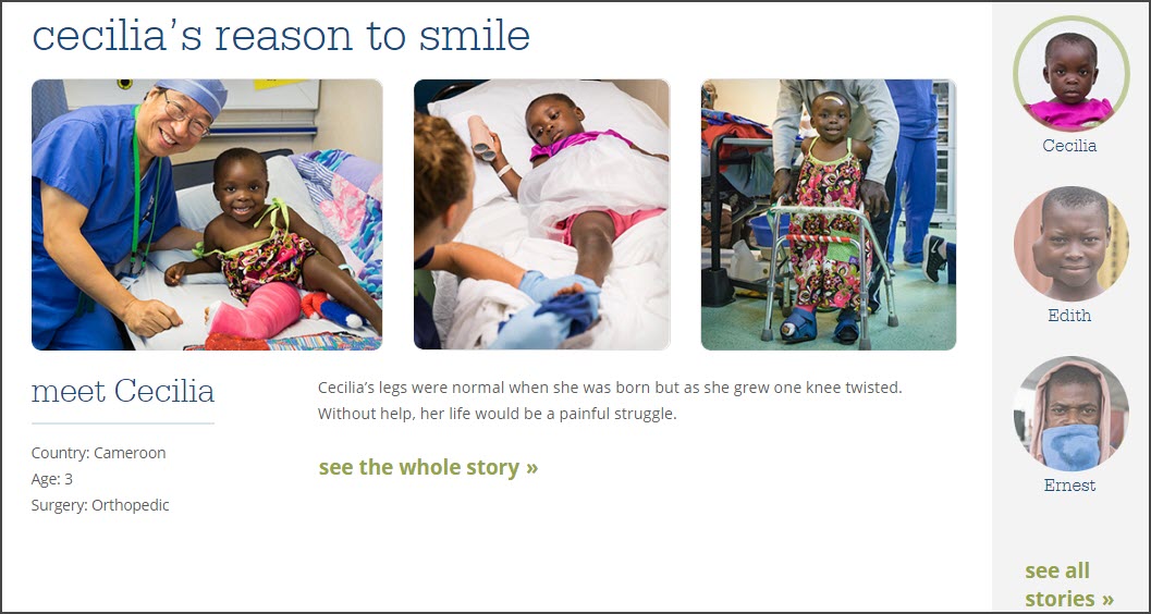
You can also do a quick home page check for the essential items listed below. The screen shots are from the Mercy Ships homepage—they’ve got it all!
1. Hero message

2. Obvious calls-to-action
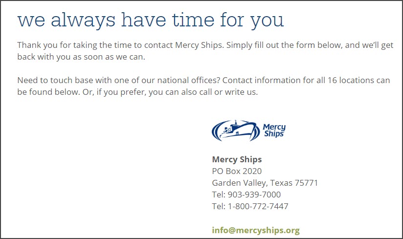
3. Clear contact information
In addition to their contact information on the home page, this is what you see when you click “Contact Us.” What a great message to site visitors!
4. Impact information
5. Social proof (testimonials, endorsements, etc.)
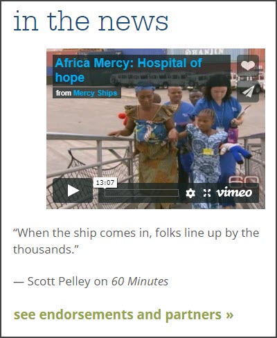
Clicking the “see endorsements and partners” link takes you here… ya’ know, no big deal… just Nelson Mandela and crew.

Some other action items you can get to work on right away include:
- Setting your call-to-action apart visually from the rest of your content. For example, place your donate button in the top-right of the page, use a bright color, and separate it from your navigation.

- Listing a phone number on your site? Make sure it can be tapped on mobile.
- Add descriptive links for people with disabilities.
- Consider making your social icons one color to match the theme of your site. A huge collection of brightly colored social icons adds cognitive load.

- Simplify your donation form by cutting down on the extra information asked for, don’t require a phone number, and don’t add a ton of images, videos, and/or distracting text.
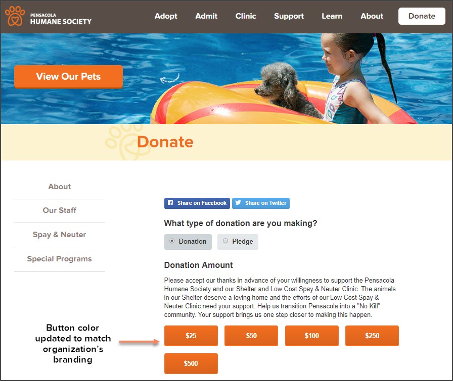
- Make sure your donation form matches your website branding and theme, especially if you’re using a third-party provider. The Pensacola Humane Society paid attention to small details, like adjusting the button colors on their Qgiv form.
- Improve your thank-you page by asking donors to do something after they make a donation, such as sharing your form on social media.
There are so many simple ways you can make your website more inviting to keep visitors coming back. What are you waiting for? Head to your home page right now and try the 10-second test!
You might enjoy

How to Plan Your Next Virtual Walk Fundraiser
Fundraising by Type


Peer-to-Peer Fundraising | The Ultimate Guide [Updated]
Fundraising by Type